|
|
|
|
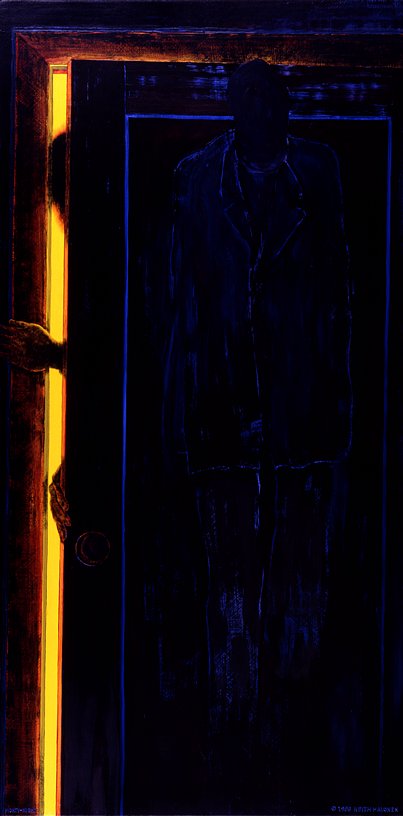
NIGHTY-NIGHT
© 1996 Keith Halonen oil on panel 24×48 in / 61×122 cm $ 12,500 US |

|
« CLICK to contact the artist |


|
CLICK » to order this print |

|
|
YOU ARE IN THE MISCELLANEOUS PAINTINGS GALLERY
CLICK THE SHORTCUT ICONS ABOVE TO VIEW MORE PAINTINGS |
|
If I have a dark side, this painting is about as dark as it gets. Most viewers come away with a sense of menace, at the very least a creepy feeling. Some, on the other hand, express their experience of feeling nostalgic warmth. This diametrically divergent interpretation was my goal.
This painting falls within the parameters of Hypermodern Realism even though its details are obscured and it is very dark. When reality is poorly lit, its details are obscured as well. I had just one thing in mind when producing this image. I wanted it to engender divided reactions in its viewing audience. I didn't want a multiplicity of reactions, just two diametrically opposed extremes. I wanted viewers to perceive it as either sinister and heavy with ominous portent, or I wanted them to see it as warmly reminiscent of their own childhood. This was a nightly scene for me when I was a young boy. After getting tucked into my bed, my mother would pull the door nearly closed and then turn off the light. The only illumination would come from a shaft of indirect hall light filtering through the space between the wall and the door. In the dim ambient light the only movement in the room would be the clothing hanging on the hook on the inside of my bedroom door. It would sway like an indistinct pendulum, dark on dark. How I felt at those moments depended heavily on events earlier in the evening. After a pleasant meal and untroubled table talk or TV watching, this scene would be warm and comforting. Given some upsetting circumstances this scene might give me night terrors and very disturbing dreams. |
|
|
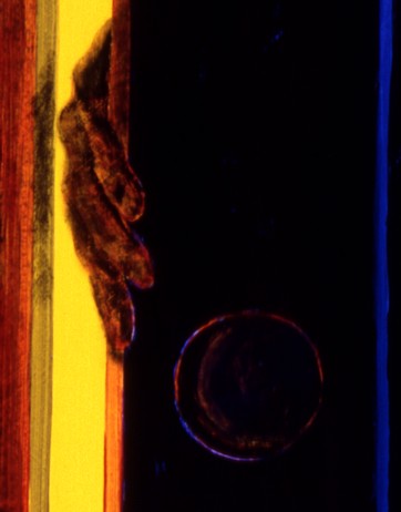
Detail from NIGHTY-NIGHT
|
|
It may interest some artists to know the color scheme I employed in this dark work. After sketching the outlines of the image elements, I painted in everything dark with solid black. I was careful to use brush techniques that left physically detectable "areas" of texture which related exactly to the image elements.
After the black paint dried I used thin color glazes over the door panels and the various areas of clothing to give the suggestion of color through light refraction. To my amazement, the camera saw these color glazes as significantly more vivid than they were perceived by the unaided eye. The photographs looked like a completely different painting, so bright were the overglaze colors! Corel PhotoPaint tools readily restored the colors to hues that closely approximated those of the original. When seen in person this artwork's coloration is very nearly iridescent. |
———————— GALLERIES ————————


|